The project to update a long neglected mid-century modern house in the Oakland hills is coming along. At what feels like a snail’s pace, but moving along none the less. In this post we’ll look at a nearly completed bathroom, a detail that makes my eye twitch, and a little bit of the history of ugly wallpaper.
This week I visited the site and found that the small bathroom which I did not feature in my last post is almost complete. It is only lacking the shower enclosure.
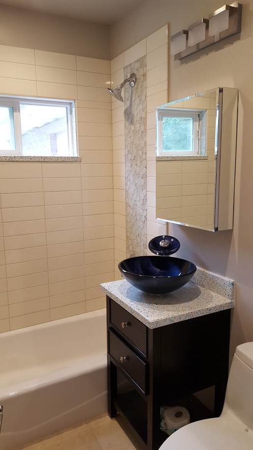
We are using the same large subway tiles, and what we are calling the “bubble” tile that was used in the other shared bathroom. The recycled glass solid surface material is the same color as we used in the Master bath (featured in my last post). Here, the client selected a very nice porcelain tile that mimics the look, if not the finish, of the limestone we have used in the other bathrooms (we ran out of the salvaged material). My only regret is that the medicine cabinet could not be recessed (the wall is PACKED with plumbing for the Master bath upstairs, and the laundry room on the other side of the wall.)
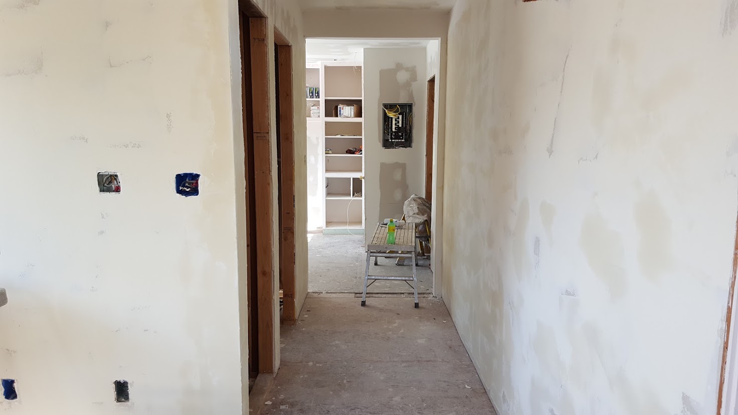
The adjacent pool room (so called because it is a room which opens up to the pool outside), is basically finished. Can you spot the detail guaranteed to make an architect’s eye twitch?
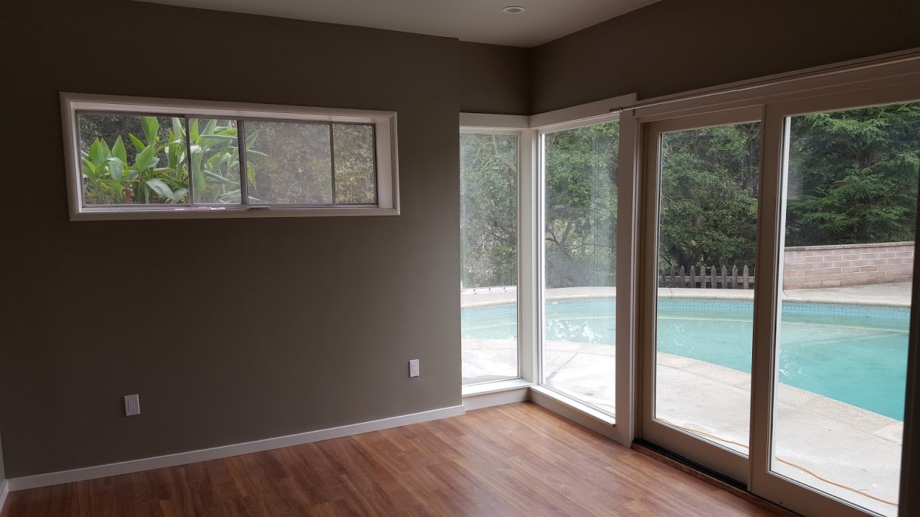
If you said the inconsistent head trim across the windows and sliding glass door, you’re right! Ugh. It is the only thing I can see in the room. We will discuss it with the Builder. He may change it himself once he sees what his employee did. He is also a stickler for details. Otherwise, I like how bright the room is and the bamboo floors look great.
Working in old houses, even “modern” ones, you find things during demolition and during construction. In this house we uncovered a little bit of the history of ugly wallpaper. Don’t get me wrong. Not all wallpaper is ugly. You have to admit, though, that these are pretty heinous.
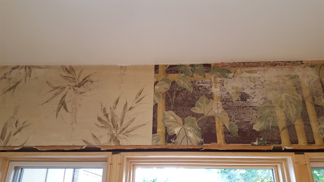
The wallpaper on the left is the current paper, unchanged from about 1961. The wallpaper on the right is the original wallpaper. The only thing I can say is that at least they kept a consistent theme. The paper on the right has some vintage charm to it which I will admit. The pattern, a vine covered bamboo trellis against a maroon background is a BOLD choice. I can’t imagine how dark it must have made this kitchen feel. That maroon background.
The newer paper comes off quite easily. It was just glued over the old wall paper. 55 years has given it some time for the adhesive to weaken. The original paper, however, has undergone some sort of alchemy and fused itself with the old gyp board. There is simply no removing the paper without damaging the wall. So we are going to remove the top layer then paint over the old paper with a couple of coats of primer before repainting the kitchen.

