Sometimes it is the little things that can make life just a bit better.
Take, for instance, having a bathroom with a spa-like feel.
You wouldn’t think that it would make much difference. I mean, honestly, you do the exact same thing in a spa-like bath as you do in a regular bath, right?
Right.
But the nicer bath just makes it so much more pleasurable and relaxing.
It’s a quality of life thing.
This is a story of a sad little bath that got a refresh and is no long sad.
This is the before picture: notice the poorly installed Pergo flooring; notice the grotty fiberglass shower pan and enclosure; notice, if you can, the corroded track from an old sliding glass door that was removed a long time ago.
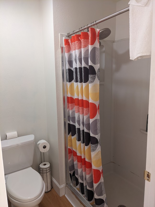
It isn’t horrible. It is functional. But that is all.
My client wanted a bath with a more spa-like feeling. One that was more contemporary in feeling, more clean, less plastic.
We had a very tight schedule to do this project, and a reasonable, but not huge budget.
This is what we did in the bathroom design to achieve our goals:
- We left all the plumbing in the same locations.
- We kept the old toilet as it was reasonably new.
- We didn’t move any walls.
- We removed the fiberglass shower enclosure and shower pan.
- We removed the shower head and faucet
- We removed the Pergo flooring and baseboards
- We only used materials and fixtures that were in stock, to avoid supply chain issues.
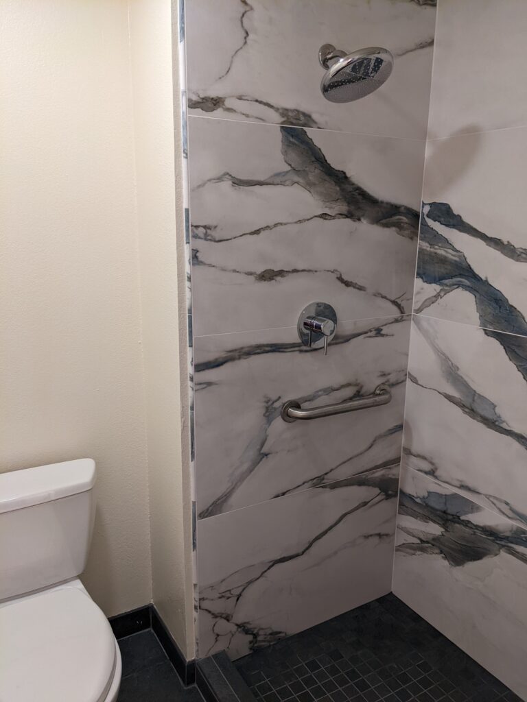
- We selected a medium gray porcelain tile for the floors, using 18×36 tiles outside the shower and 2×2 mosaic tiles inside the shower. We used the grey tile for the base board, too.
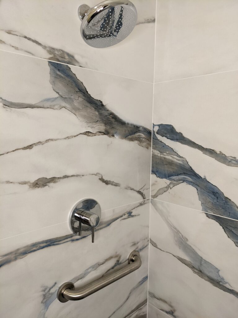
- We selected a marbled white porcelain wall tile, using enormous 24×36 size to add some drama and to reduce the amount of grout joints.
- We replaced the shower head and faucet,
- We added grab bars for safety.
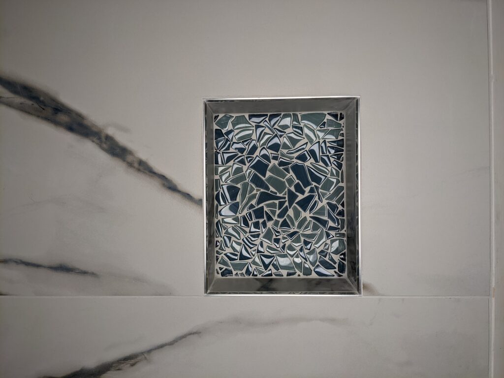
- We added a niche for the soap and shampoo. The back of the niche has tumbled glass mosaic tile.
This is the end result: the bathroom looks so much nicer. The large format tiles make the room feel bigger. We were able to enlarge the shower stall by shifting the curb out just a little bit. The marbled porcelain wall tiles feel luxurious. And the textured floor tiles make you aware that you aren’t standing on or walking on plastic, but on a substantial material. The mental shift that comes with that is subtle, but significant.
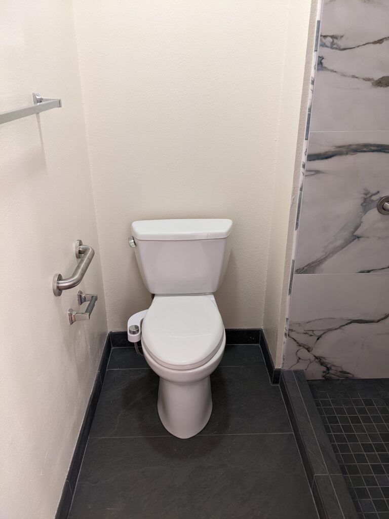
This only took 9 working days to complete. We were able to do it that quickly because we didn’t move walls or plumbing, and we only used materials and fixtures that were in stock. We bought everything ahead of time and had it ready for the contractor when he could get started.
The clients are very happy with their updated, refreshed, and more luxurious little bath. It had gone from sad to happy!
Cheers,

David
If you are interested in building a new home, an ADU, or remodeling your current home, get your copy of my Project Planning Cheat Sheet to help you prepare by setting a realistic budget and schedule. Just sign up in the form on the right side of this page.


