
2021 Random Photo Series
As a way of rounding out the year, I have decided to share 3 random photos from my phone each week, along with a discussion about why I took the picture. This might give you a sense of how I think and who I am.
Random Photo #6:
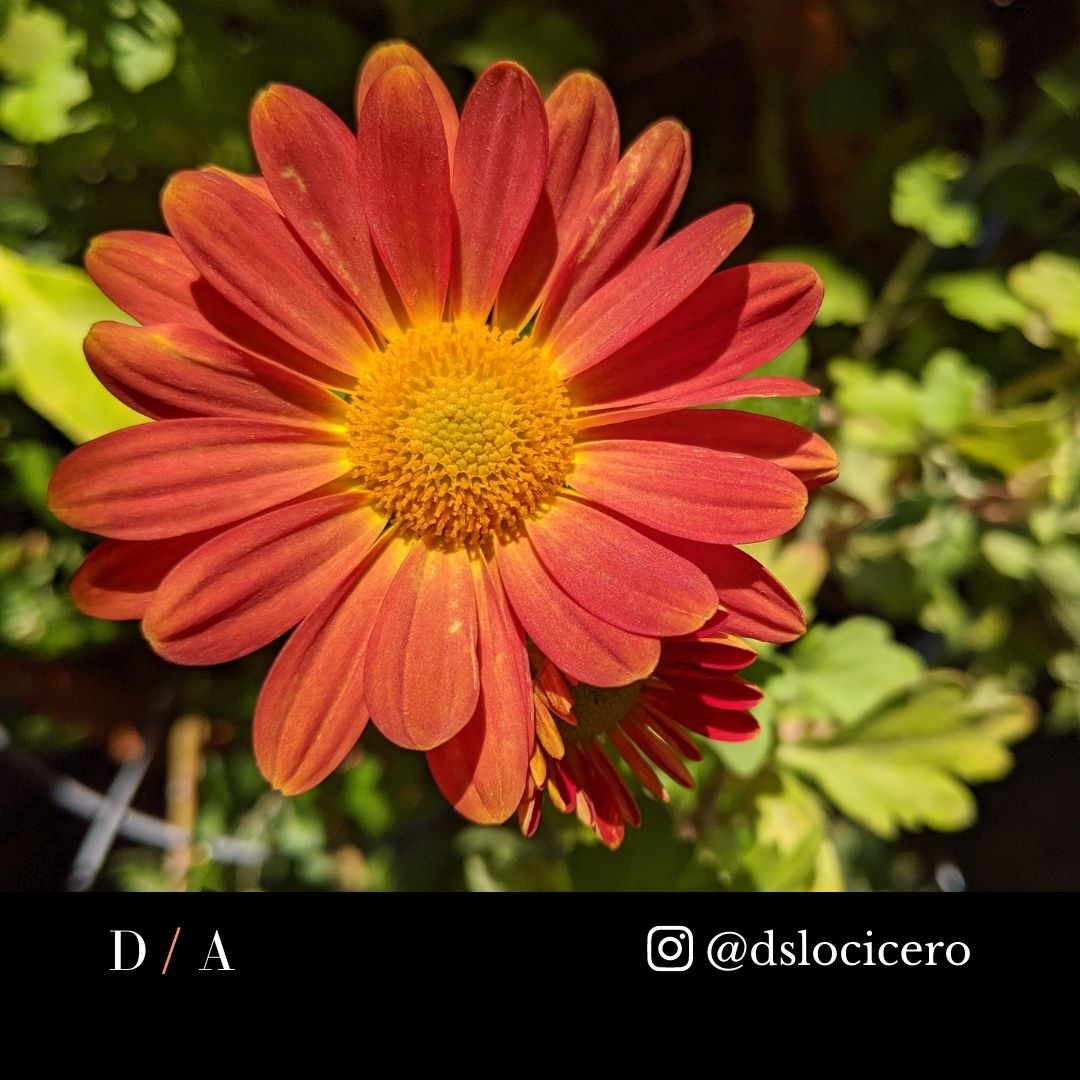
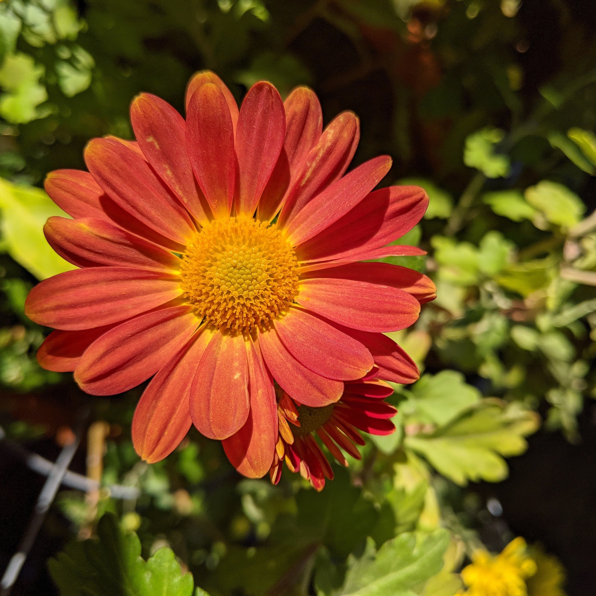
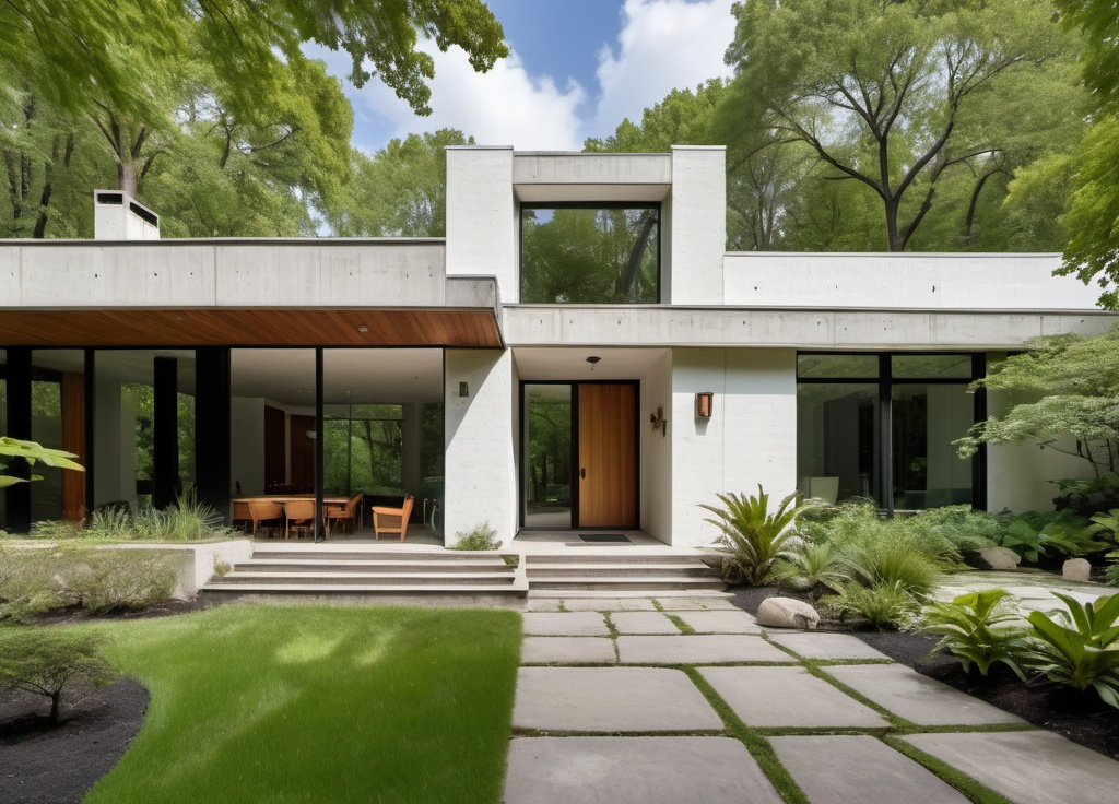
When designers talk about “natural colors”, they often mean subdued, tans, blues, and greys.
I mean the bright, vivid colors of nature: oranges, yellows, greens, pinks.
Many designers think like Armani: elegant, minimalist, and monochromatic.
I am more like Versace: elegant, yes, but more natural, and with vibrant colors.
My favorite color is California Poppy Orange. There’s no happier, vibrant color than that.
We should take our colors from nature, yes, but lets use colors from all the spectrum. Yes to the subdued earth tones. And yes to the lively, bright colors, too!
Even expensive, Zen inspired spas have exuberant floral displays! Let’s embrace more of that!
Cheers,

David
If you are interested in building a new home, an ADU, or remodeling your current home, get your copy of my Project Planning Cheat Sheet to help you prepare by setting a realistic budget and schedule. Just sign up in the form on the right side of this page.

