 David Locicero | architect
Completed in 2013
130 square feet
Private Client
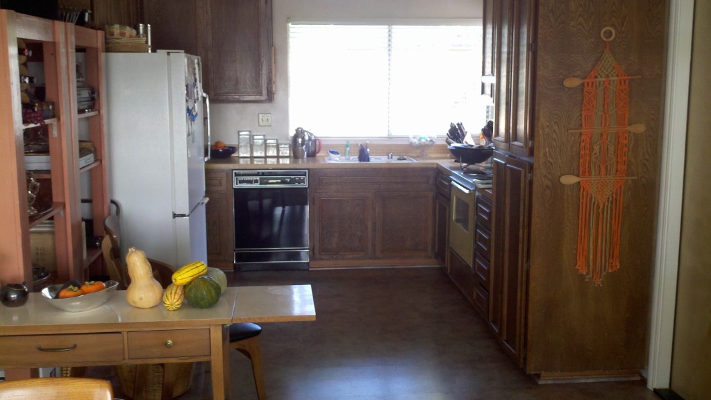
The Problem: a dark 10 x 13 foot kitchen vintage 1975 with the original appliances and insufficient counter space and storage.
The Clients: a mature, empty nest couple who are active in the community and love to cook and entertain.
BEFORE
The existing kitchen is cramped and only uses about half of the room.
THE SOLUTION
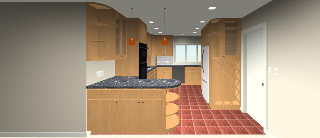
With careful consideration we came up with the design illustrated below. It captures all of the wall space in the kitchen for counters and cabinets. It introduces a peninsula between the kitchen and the dining room. The peninsula functions double duty: as counter space for baking and as a buffet when entertaining.
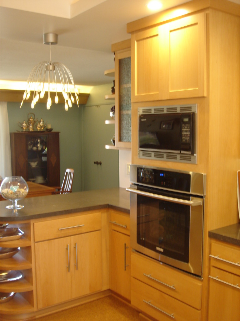
The two tall cabinets containing the built in ovens on the left and the refrigerator, pull out pantry and wine storage on the right create a visual separation between the dining room and the working portion of the kitchen. We relocated the cook top to the left side of the room and slid the sink and dishwasher over to the right. The new layout has 4 different work/prep-stations and twice the storage space.
THE RESULTS
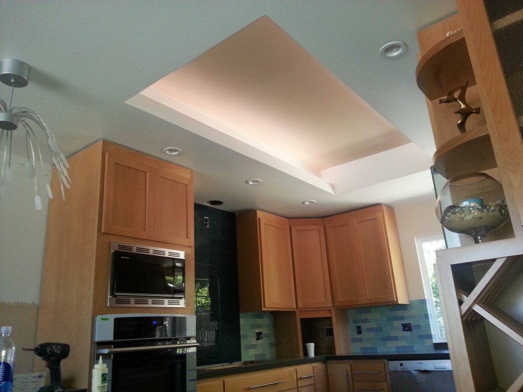
Looking up at the ceiling. Photo (c)2013 David Locicero
This photo looks up at the ceiling. You can see the single large coffer with lighting coves on two sides. This functions as ambient light for the room, not functional light. For functional light, we have both recessed down lights in the ceiling and under cabinet lighting, under the upper cabinets.
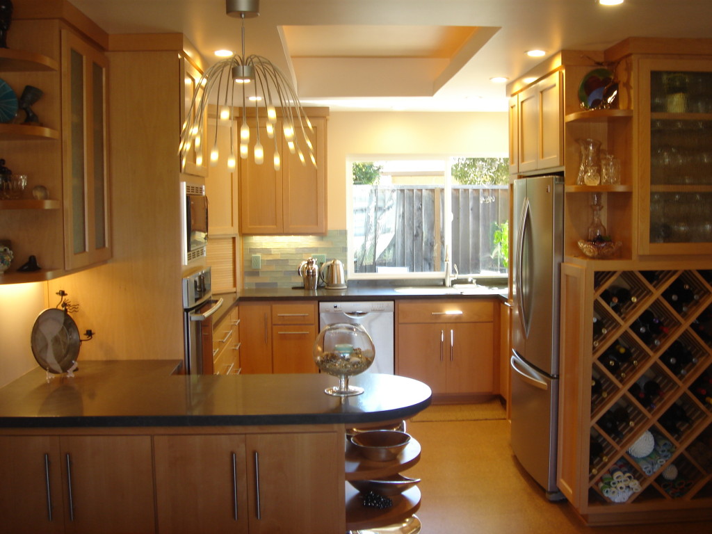
Looking into the new kitchen from the dining room.
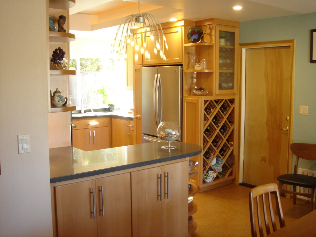
Rounded shelves and the rounded peninsula end soften the look of the kitchen.
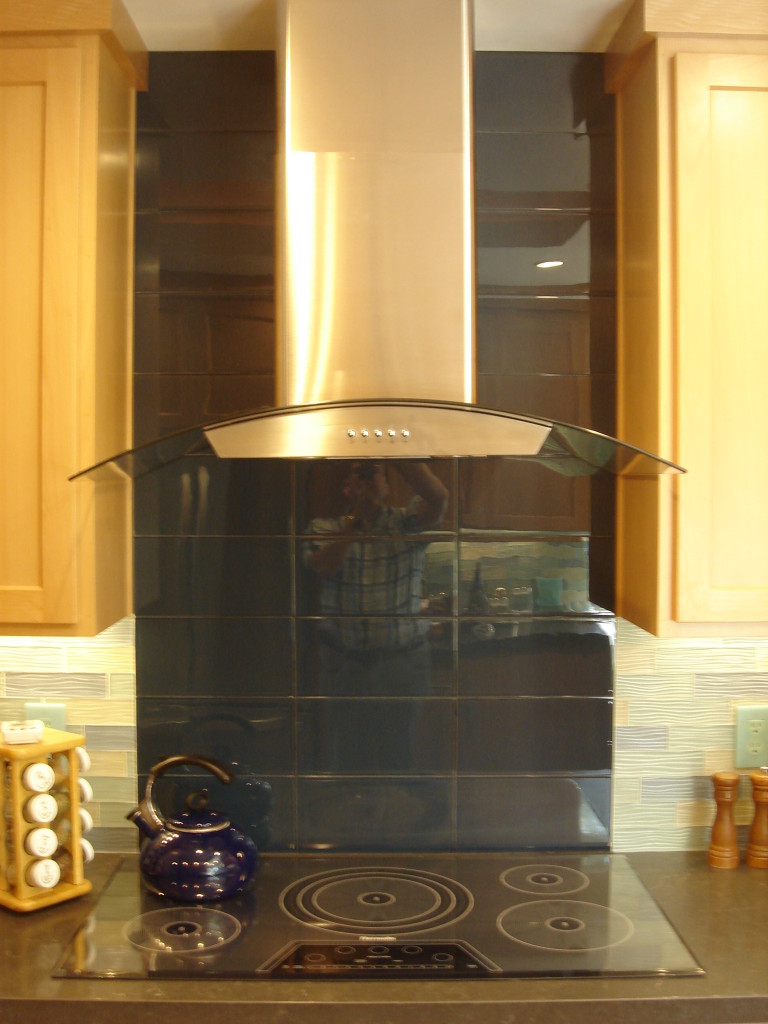
A glass tile back splash in a contrasting color runs from the counter to the ceiling behind the induction cook top.
The owner opted to replace their elderly electric range with a modern glass induction cook top. The cook top is accented with a curved glass exhaust hood and a contrasting tile from the counter to the ceiling.

In this picture looking up at the ceiling you can see all the different kinds of lighting used in the kitchen.
We created a raised area in the ceiling to help open up the confined space. The raised area is highlighted with hidden coved lighting. We also have recessed “can lights” for general illumination and under cabinet lighting for task lighting around the kitchen.
Looking from the kitchen out to the dining room.
We used simple Shaker style cabinet doors for all the upper cabinets and even more simple slab fronted doors and drawers in the base cabinets. The base cabinet doors and drawers are fitted out with brushed aluminum pencil rod pulls. The upper cabinets have hidden finger pulls routed into the door frames for a clean look.
The project more than doubled the amount of counters and storage space. The new kitchen has wine storage that the old kitchen lacked. The new window over looking the back yard now has the operable section on the left (as you look out), so that food can be passed out into the back yard when the owners are entertaining. We also provided the back yard with a 10 foot long counter for serving at bar-b-ques and parties. The new kitchen is light and bright and functional. We used custom made cabinets which are fitted with a myriad of different accessories, from a spice rack in the shallow pull out just below the cook top, to two different kinds of corner cabinets so that no spaces go to waste, to the small appliance garage to hide those pesky counter top appliances. The original kitchen lasted almost 40 years. This kitchen should serve at least as long.

